Today Only

Simplifying how UIUC students find the best food deals on campus.

Date
Aug 2024 - Dec 2024
My role
Product Design
Front and Backend Development
Made with
Context
I began this project in a computer science course at the University of Illinois Urbana-Champaign (UIUC). I worked with a team of five to design and implement a mobile app through iterative UX research, then continued refining it independently.

The Problem: Too Much Effort to Find Food Deals

Students at UIUC weren’t discovering food deals in time or at all. Existing solutions required so much effort that many students gave up on searching altogether, often missing out and losing money.
A survey from our user need research revealed:
95% of students wanted a dedicated food deal app and were dissatisfied with existing methods.
"I don't even try to find food deals anymore, I just wait till people tell me.”
"I always find out about deals after they’re over.”
Our solution needed to be so simple and seamless that even students, already shackled by time and energy, would feel motivated to use it. But to achieve that, we had to directly address the pain points that made other solutions too demanding for busy, inattentive students.

Defining the problem space & user need

Our user need research revealed two central challenges that shaped the design of Today Only:

Designing for busy, inattentive students

How might we support distracted, mobile users rushing between classes with our UI?

Implementation feasibility

With only 16 weeks total (and 3 weeks to build in Android Studio), how might we balance ambitious ideas with development limits?
📌 Note: While other stories and iterations unfolded for this project, for the sake of brevity, this case study focuses on designing for our main persona and the implementation challenge we ran into as these problems majorly shaped the result of this project.

Curious about the full design journey? Let’s chat! :D

Translating mobile constraints to design: Low-fi prototypes

To translate these needs into design, we built low-fidelity prototypes guided by thumb zone theory mobile design:

Centering the entry point around our active deal users

The app opens on Active Deals, so users pinched for time can access the active deal information they want right away without searching through the app.

Thumb zone only

The core information and navigation gestures are perfectly inside the thumb zone, keeping our active users cognitive load next to nothing!

Simple and flexible Navigation

Users can scroll and tap in and out of deal cards, making it easy for active users to navigate and assess deals while they're on the go.
Although I worked in a group, I came up with the idea and drew the original UI! These are my mock ups.

User Evaluation of Low-Fi Prototypes: Testing the layout and building the deal cards

We tested our early layout through contextual inquiries. We also created a two-part survey: a click-test to evaluate layout navigation, followed by a short user needs survey to identify the features and information users valued most for the front of our deal cards.

Strengths

  • Layout design was a success:
    • 100% users successfully located their target deal without error
    • 9/10 users easily navigated throughout features.
  •  Users enjoyed & needed descriptions: “I like that there’s a description… one time somebody told me about a food deal, and I found out I had to post on my Instagram story about it to redeem it when I got there. I was so annoyed.”
  • Sorted by active deals worked: "The time-based organization helps me quickly scan deals during breaks.”

Survey Results: What Users Value Most When Choosing a Deal

Users prioritize distance, ratings, and direct links over cuisine type or food photos

Crafting the deal card based off survery results

Design decision: Text hierarchy & my phenomenological breakdown of our user flow.

I designed the card layout by splitting information into three tiers based on user priorities:
  • The Deal Name – the main grounding information, shown most prominently.
  • Time – placed in the bottom right for quick skimming & to balance the  weight of the deal name.
  • Location – treated as tertiary information,  since the restaurant name alone is often enough for students to be familiar with the location
I designed the card layout by splitting information into three tiers based on user priorities: this hierarchy reflects the anticipated user flow —check the deal, confirm it’s active, then see where it’s offered—while still keeping the information flexible for other flows. A favorite icon on the right lets users save deals for later.

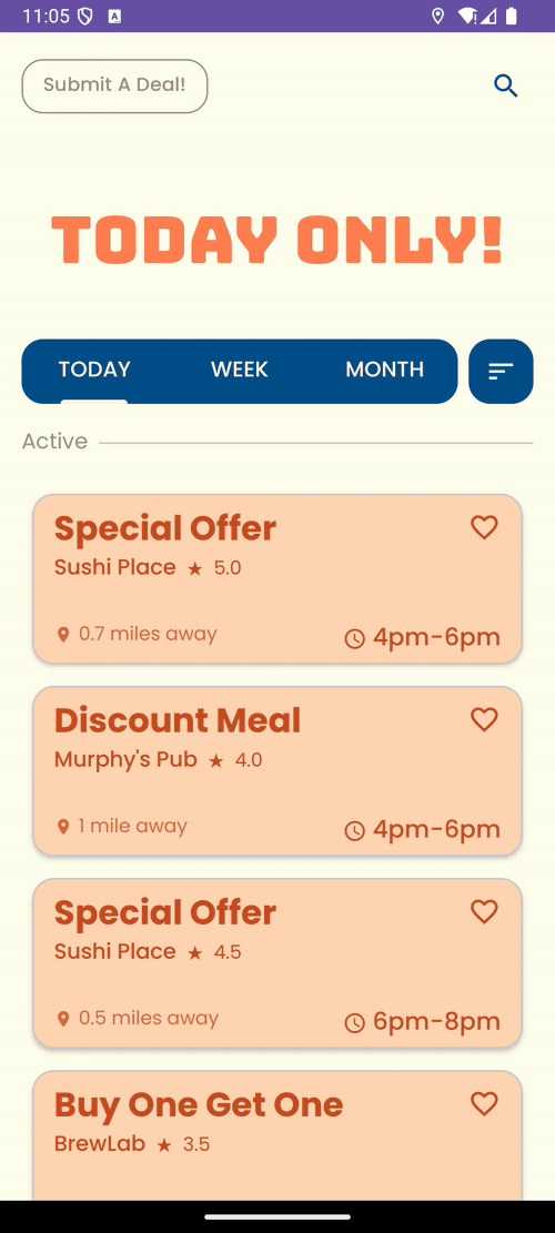
our First generation of Hi-fi prototypes: let’s talk about the color palette

With a simple design, we saw an opportunity to build strong, eye-catching branding to make our app more marketable from a business standpoint. We chose the UIUC school colors, orange and blue, to give the app a fun, energetic feel feeling and spark word of mouth. While a risky choice, we wanted to test if a fun color palette would be delightful and not overwhelming in our next round of user evaluations.
📌 Another Note:
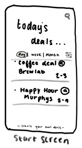
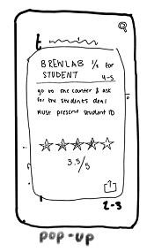
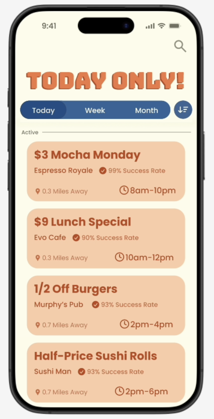
Before moving into implementation and final testing, we ran another round of usability testing and refined our hi-fi prototypes. I combine some of these results in the final testing section, again for the sake of brevity.  
Also, during the creation of the hi-fi prototypes, I led a short Figma basics workshop for my teammates!  This was above and beyond class requirements, but I knew it would be fun and make implementation seamless. While I wasn’t completely on board with every design choices for our first prototype, I help guide my team as much as I could and knew user testing would lead us in the right direction.
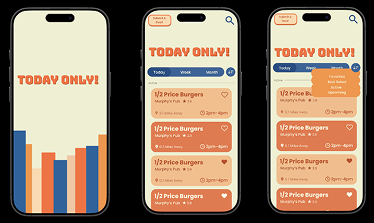
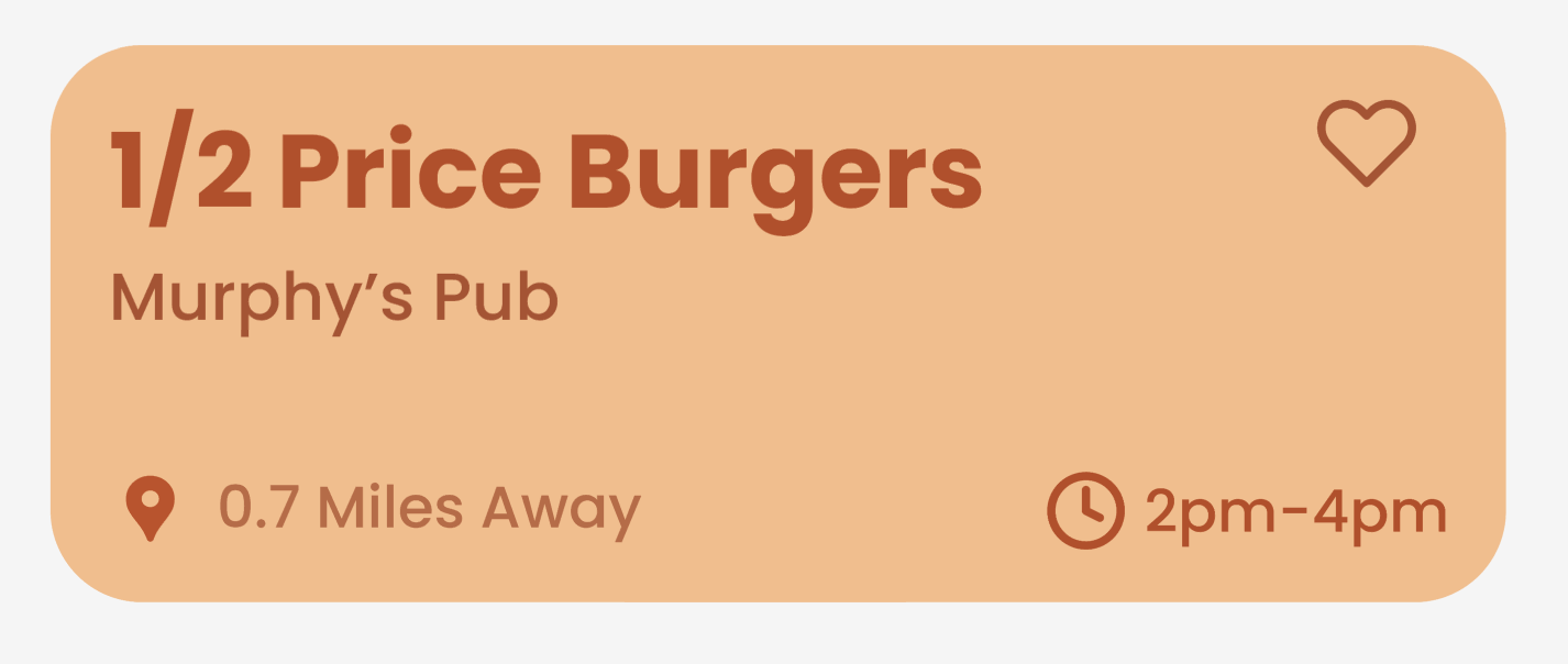
I made the logo, menu navigation bar, and the deal cards.
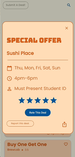
It’s Time to Code: Implementation Highlights & Challenges

It was time to implement—but within a three-week sprint, we had to make tough choices about what was realistic. This experience gave me practice in balancing user priorities with technical feasibility.

Feature Cuts & Trade-offs

We had to cut the real-time map. Although users wanted location-based features, we scoped them out due to feasibility and marked them for future development. Instead, we prioritized a reliable ratings system and a robust, error-preventing form submission—features that required deeper implementation and were stronger choices to showcase our deliverable.

how we did it:

  • Front-End (Android Studio)
    • Built in Android Studio with responsive layouts.
    • Integrated react-native-calendars + Google Calendars API for recurring deal scheduling.
  • Back-End (Django + APIs)
    • Deployed on Python Django
    • Created REST APIs for deal listing, detail retrieval, submissions, and ratings.
    • Implemented a Django admin panel to moderate and validate user-submitted deals.

User Evaluation of Functional Prototype & Beyond Class Refinement

We conducted another round of contextual inquiry testing on our functional prototypes. Final design refinements were made by me in Figma after the class ended!

Successes

  • Navigation remained strong: 6/6 users across all test groups successfully completed tasks without navigation blunders.
  • People enjoyed our front facing deal card layout:  “...This [deal card] is everything I want to see... super clear and straight forward.”

discovered pain points and beyond class refinement.

Pain Point #1 — Mixed user response to the color palette

Some participants  found the palette appealing, while others thought it was too dark and outdated (results from in class feedback and user interviews).

Solution:

meet both users in the middle by neutralizing the palette and make design elements more accessible and on industry design trend

Thought process:

I modernized the color palette by reducing saturation. I also recolored components to strengthen information hierarchy and polished elements so are better match for current UI trends. (The submission form was my biggest change, but outside this write-up’s scope.)

Pain Point #2 — Issues inside the deal card

Location visibility: Participants wanted to see where a restaurant was located and noted they might need to leave the app to find this information.
Navigation wasn’t perfect: Users found the close (“X”) button hard to reach, making it inconvenient to exit a window.
Confusing rating metric: The “4 out of 5 stars” label was unclear—participants weren’t sure if it reflected food quality or deal quality.
Before
After

Changes:

• Added location map and restaurant links.
• Replaced rating system with a familiar format.
• Updated deal cards to swipe overlays — allowing more space for information and aligning with common industry mobile patterns.
• Added “…” menu for rating/report features to reduce visual noise.
• Improved hierarchy and grouping for clearer readability

Conclusions & Lovely Lessons Learned

1. Design Collaboration & Team work

This project taught me a lot about myself in a group design setting and what I bring to a team. I found that I’m flexible, with strong communication and leadership skills, I like to take initiative while ensuring everyone stays on the same page. There were moments of design differences, and learning how to navigate those tensions productively, without letting them turn sour, felt like one of the major successes of this project! (:

1. Learning the language of development

Building a functional interface gave me insight into how front-end and back-end processes work in development. At NCSA, it felt like in team meetings, designers, PMs, and developers often spoke in different “languages”, many terms with the same meaning just with different names. Understanding this communication style and the realities of implementation has shaped now only design and but how I communicate. I was told I make good hand-off notes!

2. Presenting & Storytelling

Weekly class presentations sharpened my ability to explain design choices clearly and confidently, reminding me that strong presentation skills are just as critical as strong design skills. My hope is that this case study reflects that clarity and makes the process easy to follow.

3. Feasibility & Flexibility

This project taught me how to manage feasibility. Even when a feature aligns beautifully with the vision, time constraints often require compromise. At first, trade-offs and cuts felt uncomfortable, since I always strive for ideals. But I learned that making cuts elegantly, preserving authenticity while prioritizing what’s achievable, is a valuable skill. At NCSA, I saw many more examples of this, which reinforced that balancing feasibility is not a weakness but an essential part of building confidence in the process and product.

Final Prototype

Many more decisions shaped the rest of the design. Have questions about Today Only? Let’s chat!